The Strange Complexity of Picture Books: A Case of Adult Infiltration

For something which is generally expected to be short, compact and aesthetically appealing, the picture book can embody quite a bit of complexity. My main takeaway from our discussion on picture books and difficult topics was the focus on functionality and how we assess it. What does a picture book do? Do different kinds of picture books do different things? What is a good picture book? What are the standards of judgment? What is it supposed to do? Simultaneously, it is interesting to see how the answers to these various questions might vary depending upon who the reader/viewer/listener is and under what circumstances and conditions, contact/communication with the book happens.

Image result for duck death and the tulip
Duck, Death and the Tulip, written and illustrated by Wolf Erlbruch

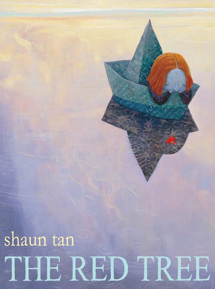
Why are picture books often aimed at children? Perhaps “aimed” is not the most appropriate word, let’s say – why are picture books considered suitable for children? Is it the economy of words or the abundance of images? Perhaps it is this combination itself which allows it to become accessible to the child just learning new words and struggling with complex ideas (example: death, trauma, sexuality). However, it might fall in the trap of oversimplification of complex ideas, to the point where death is explained and examined as a ritual, which exempts the emotional aspect of the incident. This happens in The Dead Bird by Margaret Wise Brown (illustrated by Remy Charlip, and later by Christian Robinson). On the contrary, Wolf Erlbruch’s poignantly beautiful Duck, Death and the Tulip takes an entirely different approach. The uncomfortable question however is, why do we as adults have a problem with the matter of fact tone of The Dead Bird? Will a child reading it react similarly? Will a child even read it? Or will it be read to him/her? The problem is, a large part of the material meant for children has to pass through the filter of adult censorship. Perhaps we are not comfortable with children being comfortable with certain things or perhaps we are far too protective, our indulgence of them is careful, measured, limited. The aim is not to find flaws in our approach but humbly accept the reality of it. For similar reasons, Shaun Tan’s The Red Tree can seem far too complex and ambiguous for children. We might think, its dystopian images, complex symbolism and narrative structure will be hard to unpack for the child. After all, it’s hard enough for us! I personally feel, it’s one of those books that work well because of its complexity. It has the potential to be something different for everyone at different points in time.

The Mysteries of Harris Burdick, written and illustrated by Chris Van Allsburg

This brings us back to the question of what does a picture book set out to do? My observations tell me this is largely unfixed and changeable. It may not always have a simple linear narrative. Picture books can have clear goals and messages and function as message books of some sort. These books are separate from others which might be quite ambiguous or open ended. The latter can be seen as set of visual, textual resources which can be used to make multiple meanings. I’d call these ‘resource books’ – a visual-textual toolkit of sort, with various uses. Another example of resource books would be Chris Van Allsburg’s The Mysteries of Harris Burdick. Here, there are no stories and at the same time many, endless stories. It is a collection of uncanny and unexplainable illustrations with captions which invite us to weave our own.

The functionality of the illustrated book, one may conclude, is driven by the combination of economy of words and abundance of images in actual spatial terms of the print surface. The author and/or illustrator faces the creative challenge of accommodating something intelligent, beautiful and resourceful that often, if not always ends up passing through the parental filter.  And Tango Makes Three, written by Peter Parnell, Justin Richardson and illustrated by Henry Cole seems to “get this right”. The story of a couple of male penguins who form a family and bring up a chick, skips all the pitfalls of over explanation and celebrates gay love in the most beautiful, natural way possible. Despite being based on true facts, even this book reportedly had to face hard censorship. And this, makes me think – will there ever be that perfect picture book? Isn’t it about time we sat down and examined how parental filter works, besides engaging with a book’s aims and functionality? Therein lies the complex mystery of children, autonomy and the world of stories and non-stories.

About the author: Aratrika Choudhury is an illustrator and a second year PhD student at QMUL. Her masters focused on Bengali illustration culture, and her doctoral research focuses on print culture and colonial book history.

The Text of Picture Books: Font and Typesetting

According to scholar Jenny Uglow, illustrations have been part of children’s publications since the early eighteenth-century due to ideas about children’s education – and, in particular, John Locke’s views of children’s education. Locke believed that children needed pictures of things in order to both entertain and educate them – what good is learning the word ‘lion,’ for example, without any idea of how a lion might look?

Locke’s ideas of illustrating children’s books for practical educative purposes has certainly stood the test of time, yet contemporary picture books attempt to do more than simply educate children on how the world looks. Now, picture books can be used as tools to help children process feelings and ideas. In our recent Centre for Childhood Cultures reading group, we read three picture books dealing with large or difficult topics: The Red Tree written and illustrated by Shaun Tan, The Dead Bird by Margaret Wise Brown with illustrations by Christian Robinson, and And Tango Makes Three by Justin Richardson and Peter Parnell with illustrations by Henry Cole.

And Tango Makes Three
The cover of And Tango Makes Three by Justin Richardson and Peter Parnell, with illustrations by Henry Cole

While these three books deal with vastly different topics in vastly different tones, something that struck me while experiencing these three books was the way that the printed text functioned as an extension of the mood or tone of the book. For The Red Tree, a picture book that deals with depression or perhaps grief, the text is slightly off-kilter – certain letters sat a bit higher than others, as if they had been typed by a broken typewriter. The edges of the letters were rugged, rather than crisp. In And Tango Makes Three, a heart-warming book about a non-traditional penguin family, the text is written in a joyful, clear font. It does not come across as sterile, though; rather, the font looks lived in and warm, while at the same time the letters are easy to read for children just learning their alphabet. At times, words in the text might be bigger or in all-capital letters for emphasis, like the ‘CRAAAACK’ of Tango emerging from her shell. The spelling and size of this onomatopoeia make it integral to the illustration it describes. In The Dead Bird, the text is a straight sans serif font – it seems to not want to call attention to itself, almost blending into the illustrations. Like the words of themselves, the physical text of The Dead Bird is unadorned.

The 2016 re-issue of The Dead Bird by Margaret Wise Brown, illustrated by Christian Robinson

I began to consider how the written text – by which I mean the font and text placement itself – becomes an extension of the illustrations in children’s books. It seems somehow akin to concrete poems, or, poems in which the arrangement of the words on the page convey meaning more than the words themselves – for example, a poem in which words are arranged as drops of rain, or in which curl words in on themselves in a spiral.

Who chooses how to typeset the text in a children’s picture book? Who decides on and designs the font? If the writer and illustrator are two separate people, how do they collaborate on the design of the font? And who is the font for? If a pre-literate child looks at the page, does the font or the placement of the words register? How does the look of the written text inform an adult’s experience of the book when reading to a child?

The cover of The Red Tree by Shaun Tan

Uglow writes, ‘however closely writer and artist work together, their work can never ‘mean’ the same, because meaning is bound up with the writers’ system of alphabetic symbols and words, and the artists’ lines, shading and colours’ (140). Yet, when text becomes art, can meaning begin to cross the boundaries between the verbal and the illustrative?

About the author: Abigail Fine is a third year PhD student at QMUL. Her research focuses on Cinderella adaptations in the twentieth and twenty-first centuries, with an emphasis on Young Adult and Middle Grade adaptations.

References and Further Reading

Aube, Christina and Nancy Perloff. ‘What is Concrete Poetry?’ Getty Iris Blog (blog). March 23, 2017.https://blogs.getty.edu/iris/what-is-concrete-poetry/

Uglow, Jenny. Words & Pictures: Writers, Artists and a Peculiarly British Tradition. London: Faber and Faber, 2008

Villarreal, Alicia, Sylvia Minton, and Miriam Martinez. ‘Child Illustrators: Making Meaning Through Visual Art in Picture Books.’ The Reading Teacher. November/December 2015. Vol 69, No. 3., p 265-275.

‘We Are Water Protectors,’ Timelessness, & Children’s Book Awards

In 1951 Lillian Hollowell, an associate professor of English at Murray State College in Kentucky, asserted that, in choosing the Newbery and Caldecott award-winning books, ‘time tells the story here as elsewhere. Great books live… Only time can estimate the far-reaching influence of book awards in the field of children’s literature’ (Hollowell, 491). Indeed, winning a Newbery or Caldecott does seem to ensure at least some publication longevity: even a few early Newbery winners, like The Voyages of Doctor Dolittle by Hugh Lofting (Newbery winner 1923), Caddie Woodlawn by Carol Ryrie Brink (Newbery winner 1936) and Twenty-One Balloons by William Pène du Bois (Newbery winner 1948) are still found on shelves in bookshops large and small.

If an unstated goal of the Newbery and Caldecott awards is to award books with the potential for far-reaching influence through the longevity of their relevance, how, then, does the time period of a book fit into its consideration for one of these two awards? Is a book more likely to succeed if it feels ‘timeless,’ rather than engaging with current issues?

Writing in 2016, Miriam Martinez, Melanie D. Koss, and Nancy J. Johnson discovered that in the 25 years preceding their study, 56% of the Caldecott medal and honor books with human characters were set in the past, while only 38% were contemporary. They note that over time, however, there has been an increase in contemporary settings. I have found this same trend in the Newbery-winning books: from 1995 to 2010, nine of the sixteen books selected for the medal were historical fiction, and one was science fiction. All six of the medal-winning books from 2000-2005 were historical fiction. Yet, of the twelve medal-winning books from 2010-2021, only two books have been historical fiction, and one fantasy.

Past Caldecott contenders, such as The Adventures of Beekle: The Unimaginary Friend (2015 Caldecott winner) or This Is Not My Hat (2013 Caldecott winner), or even Me… Jane (an illustrated biography of Jane Goodall, Caldecott honor 2012) tend to prioritize a certain sense of the timelessness and universality of childhood experiences, and they often exist in fantasy space. They read as non-controversial, or even feel-good stories. They seem to want young children (and, perhaps even more, adults) to marvel at their illustrations and to learn lessons about inclusion or to find inspiration to achieve their dreams.

The Undefeated by Kwame Alexander, illustrated by Kadir Nelson

In the past five years, however, the Caldecott award-winning books have seemed to engage with contemporary issues in a way that historically they have not. Perhaps the timely can also be the timeless. Kwame Alexander’s The Undefeated (2020 Caldecott winner), illustrated by Kadir Nelson, celebrates Black American history and even includes a direct reference to the Black Lives Matter movement.

This year’s Caldecott winner, We Are Water Protectors by Carole Lindstrom, illustrated by Michaela Goade, signals a continuation of the trend to choose books that focus on important issues of our moment. We Are Water Protectors, even in its very title, is bound to be a controversial pick for some Americans. It is a tale that directly calls on us to act to protect the environment, and it recalls the recent maltreatment of indigenous communities surrounding the protests over the Keystone Pipeline. The book itself centers around the Dakota Access Pipeline – rendered as a reference to the Ojibwe tribe’s Black Snake Prophecy. Michaela Goade is the first indigenous artist to win this award in its eighty-three-year history.

We Are The Water Protectors by Carole Lindstrom, illustrated by Michaela Goade

While this book’s focus on the Dakota Access Pipeline and impending environmental disaster is timely, does not the destruction of the environment and the destruction of indigenous communities have an unfortunate timelessness in American history, too? The fact that this is the first Caldecott-winning book with both an indigenous author and illustrator speaks volumes to the suppression of Native American voices in both publication and in prestigious recognition. Yet, in the very act of awarding We Are Water Protectors the Caldecott, perhaps we have begun to take the first steps towards rectifying some of the wrongs that this book, by its very existence, calls into question.

About the author: Abigail Fine is a third year PhD student at QMUL. Her research focuses on Cinderella adaptations in the twentieth and twenty-first centuries, with an emphasis on Young Adult and Middle Grade adaptations.

References and Further Reading

Hollowell, Lillian. ‘Children’s Book Awards.’ Elementary Education. December 1951. Vol 28, No. 8, p 468-474, 491.

Martinez, Miriam, Melanie D. Koss, and Nancy J. Johnson. ‘Meeting Characters in Caldecotts: What Does This Mean for Today’s Readers?’ The Reading Teacher. July/August 2016. Vol 70, No. 1, p 19-28.

List of all ALA Newbery Medal and Honor Books: http://www.ala.org/alsc/awardsgrants/bookmedia/newberymedal/newberyhonors/newberymedal

List of all ALA Caldecott Medal and Honor Books: http://www.ala.org/alsc/awardsgrants/bookmedia/caldecottmedal/caldecotthonors/caldecottmedal